


It’s not surprising that in our contemporary minds, graphics matter. Over the years we’ve seen a steady increase in getting the biggest, best picture we can get for our visual screens. 4K resolution screens, virtual reality, and augmented reality technologies are changing how we view and interact with narrative. Not long ago, however, things were much more low key.In fact, for millenia, humanity utilized a much more limited toolkit for expressing ourselves visually. While the methods for visual representations have continued to evolve over time, the fact remains that even the earliest cave paintings tell stories–stories of everyday life, of existance.

There’s a great deal of scholarship involved in the art of visual rhetoric–how we use graphical tools to transmit specific messages. Sometimes, the images themselves convey the message, othertimes, the message comes alongside the image. In this case, text and image interact with one another to create a more rounded version of the message.
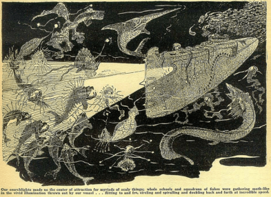
As industrialization progressed, and pulp magazines were established, we see an increased use of graphical accompanyment alongside included stories. In Sillar’s chapter “Illustrated Magazines” from Visualisation in Popular Fiction, he challenges scholars to look at the relationship between images and text–how does their blending contribute to our expeirence of reading? To the overall ideology of the magazines? (76) Quite often, included images do not depict the entirety of a story, but rather highlight specific moments, often climaxes or otherwise dramatic situations. While these may have served to draw in potential readers with flashy renditions of narrative elements, they also served to enhance the stories themselves. While this may not surprise modern audiences, inondated with pop up ads, GIFs, videos, and flashy graphics infiltrating stories read online, graphic inclusion in pulp magazines would have been a vastly different story. While cover art and advertising images were commonplace, not all stories were given a graphical counterpart. Rarer still it seems, at least in the magazine’s we’ve surveyed thus far, was it for stories to be given more than one graphic, if they were given one at all. While covers drew readers into a particular story, increased use of graphics in other areas would help to engage readership further, and perhaps, produce repeat customers.
It’s interesting to consider how print technology changed alongside the earliest days of pulp magazines and throughout their run; the cultural elements that went alongside what kinds of images were or were not included. It is here we again see an artifical divide between high and low culture. As Mussell discusses in Chapter 2 of The Ninteenth Century Press in the Digital Age, while both ‘proper’ literature and pulp magazines utilized versions of woodcut print technology, woodcuts/wood engravings for pulp magazines were considered vulgar and quick. Conversely, wood carvings were considered high art forms that took longer to produce, and thus matched the cultural strata of “real” literature. As culturally low as woodcuts may or may not have been precieved, their inclusion in pulp magazines (and later hand-drawn graphics) opened up a wide array of new options for would-be readers. In addition to a likelihood of increased engagement (after all, who doesn’t love pictures), they also helped to make each magazine more unique by developing an art style. Like Sillars suggested above, images produced in these magazines contributed to the ethos of the magazine–who they would market themselves as and who they would market to. Pictures also allowed for individuals to engage with the material who struggled with reading the stories, or perhaps couldn’t read at all.
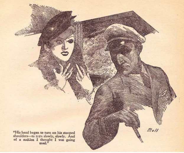 In preparing for class this week, I was struck by just how much my opinion of an image could change how I read or understood a story in a pulp magazine. While the image I chose to work on was relatively simple, it depicted a very specific climax of the story. I made note of what I could “read” in the image before actually reading the story, as well as a reflection after the fact. In truth, on its own, the image did very little to entice me to the story, but its inclusion gave me a lot of things to reflect on after the fact. Beyond my own analysis, I was even further impressed at how versatile such an image was for engagement throughout the class, as multiple people had chosen this image for their own analysis. While some of us struck the same chords, there was a lot of variation in how the image affected our individual perspectives.
For me, the image served more to reinforce the ‘moral’ of the story, which appeared to be governed by a less-than-covert warning against rising above your station. Aristocratic/Upper Class woman rises too high into the clouds, sees a ghost, tumbles nearly to her death, and vows never to fly again, lest she ‘go too high.’ There’s safety to stay within your means. The woman in the image is clearly finely dressed, and flying at the time of this publication would have been exorbitantly expensive. Before reading the story, consumers of this may have understood that the main character was upper class based on this image. Further still, the moral of the story, may have run louder because of it. If a woman of high stature can fall to this, perhaps I can too? Perhaps I should be more cautious?
All of this of course, goes along with the idea that pulp magazines cultivated particular cultural goals for their readership to consume. Ways to be proper citizens, proper men, proper women. I digress slightly from the goal of this post, but stereotypes and cultural roles would have been just as enforced in the artwork that surrounded pulp magazines, as their printed stories and ads would have. Different images would have conveyed different messages, but for the time and cost involved in image inclusion, we can be sure the messages were deliberate. Who was in charge of creating the message, or what message was intended, however, is an intriguing question worth pursuing in this area of study.

2 thoughts on “Imagining Text”